
Reports, Reporting for Duty
At Maurer-Stutz Geospatial Services, we have many projects that require reporting. Today, we want to help other ArcGIS Pro users utilize the reporting functions built within that system in an easy and effective way.
Utilizing ArcGIS Reports
At Maurer-Stutz Geospatial Services, we have many projects that require reporting. Today, we want to help other ArcGIS Pro users utilize the reporting functions built within that system in an easy and effective way.
The Reports function allows you to quickly generate a report from your data. You can:
Display only the fields you specify for each feature.
Add visual elements like graphs and charts.
Filter the data to show only what’s relevant to the purpose of the report.
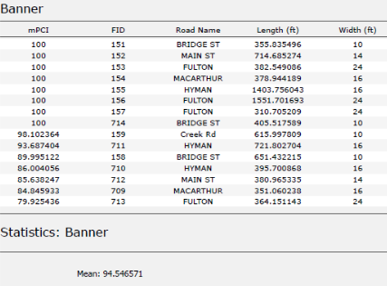
In this example, I used road assessment data as my source, and wanted to create a report showing me each road across 11 different towns, sorted from worst to best based on their score (mPCI).
Step 1: Select Your Data
Select the map frame that contains the data you want to use.
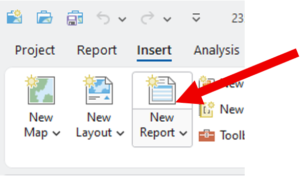
Go to the Insert tab and click New Report.
Step 2: Choose a Template
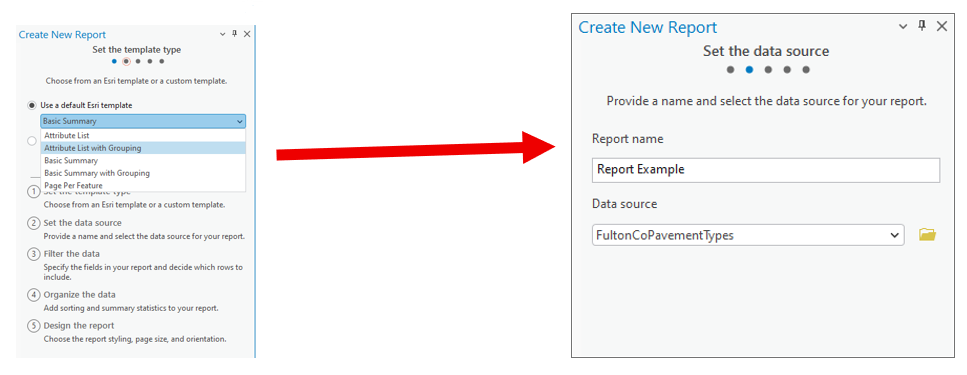
Select a report template.
Example: Choose Attribute List with Grouping.Name your report.
Select the data source (the dataset you’ll report on).
Step 3: Organize the Data
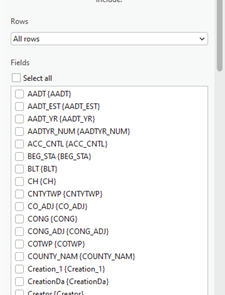
Choose the fields you want to display.
Example: For a road assessment, include:Road Name
Assessment Score
Length
Width
Material
Other relevant details
Tip: Drag and drop fields to reorder them in the report.
2. Select a grouping field to organize your report.
Example: Group by Municipality.
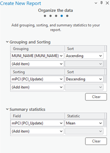
3. Define sorting rules within each group.
Example: Sort roads by Assessment Score (descending),
so the lowest scores appear first.
4. (Optional) Add group statistics:
Choose a field (e.g., Assessment Score).
Select a statistic (e.g., Mean) to summarize each group.
5. Set your page size and click Finish.
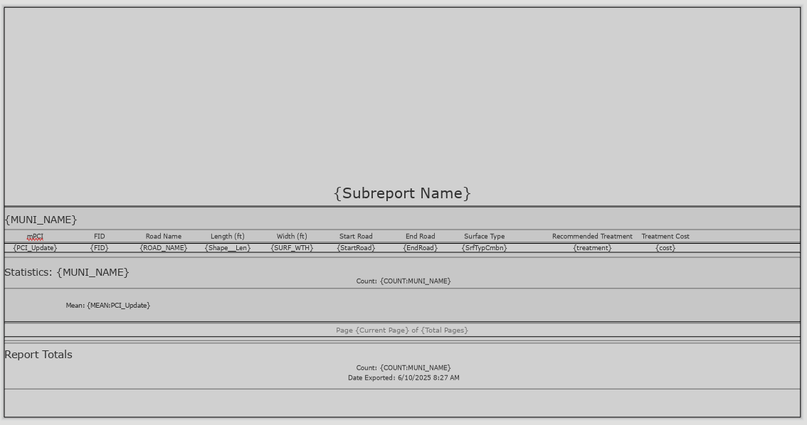
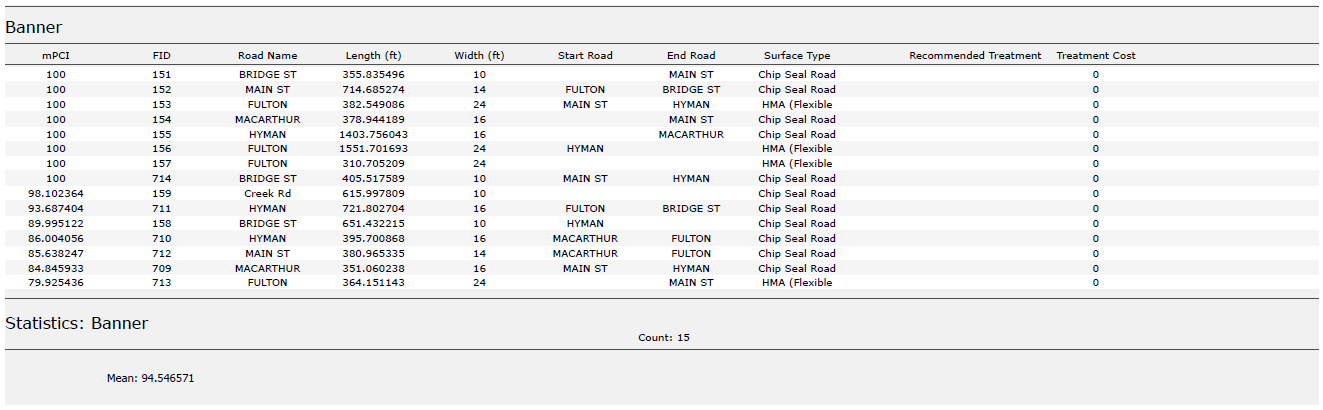
Step 4: Preview the Report
Your report will now display:
Each road grouped by municipality.
Roads within each group sorted by assessment score.
You can rename column headers to make them more readable.
(Just like editing text in Layout View.)
Step 5: Export the Report
Export the report as a PDF or another supported format.
Your final report will include:
Organized, grouped, and sorted data.
Optional charts, statistics, or summary sections if added.
Additional Tips
Use the Insert tab to:
Add more fields or statistics after the report has been created.
Insert charts, dynamic images, or text blocks.
Choose where these additions appear:
Statistics Group: Appears at the end of each group (e.g., each municipality).
Report Totals: Appears at the very end of the full report.
We hope this has been a casual guide to creating reports in ArcGIS. It walks you through generating a report from your data, showing you how to pick what information to display, add visuals like graphs and charts, and filter what's relevant. You'll learn how to select your data, choose a template, organize your information by grouping and sorting, preview your report, and finally, export it as a PDF or other format. There are also some neat tricks for customizing your report, like adding more fields or charts after it's been created
If you have other questions please don’t hesitate to contact us in the form below.

Mapping for a Cause
At Maurer-Stutz, Inc., we believe in using our expertise to give back to the community. One of our on-going relationships is with Camp Big Sky, a nonprofit in Fairview, IL, dedicated to providing outdoor experiences for individuals with disabilities.
Mapping for a Cause: Supporting Camp Big Sky with GIS
At Maurer-Stutz, Inc., we believe in using our expertise to give back to the community. One of our on-going relationships is with Camp Big Sky, a nonprofit in Fairview, IL, dedicated to providing outdoor experiences for individuals with disabilities.
“We’d Like a Map”
Camp Big Sky recently inquired about the possibility of having Mauer-Stutz Geospatial create a large display map to provide visitors with a clear overview of the camp - similar to maps found at theme parks or the beginning of a hiking trail. That request for a single map began a series of conversations.
Through our discussions with Camp Big Sky, a robust GIS solution developed allowing for the creation of a whole variety of customized maps. We discussed their need for duplicatable, day-use maps, maps specifically tailored for grant applications, online maps, etc.— all of which can easily be created from the GIS that was already being built!
How We’re Helping
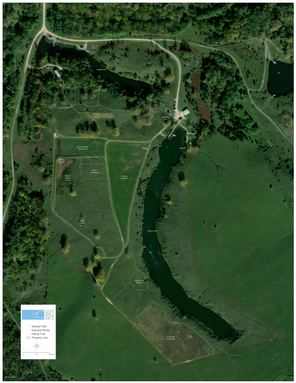
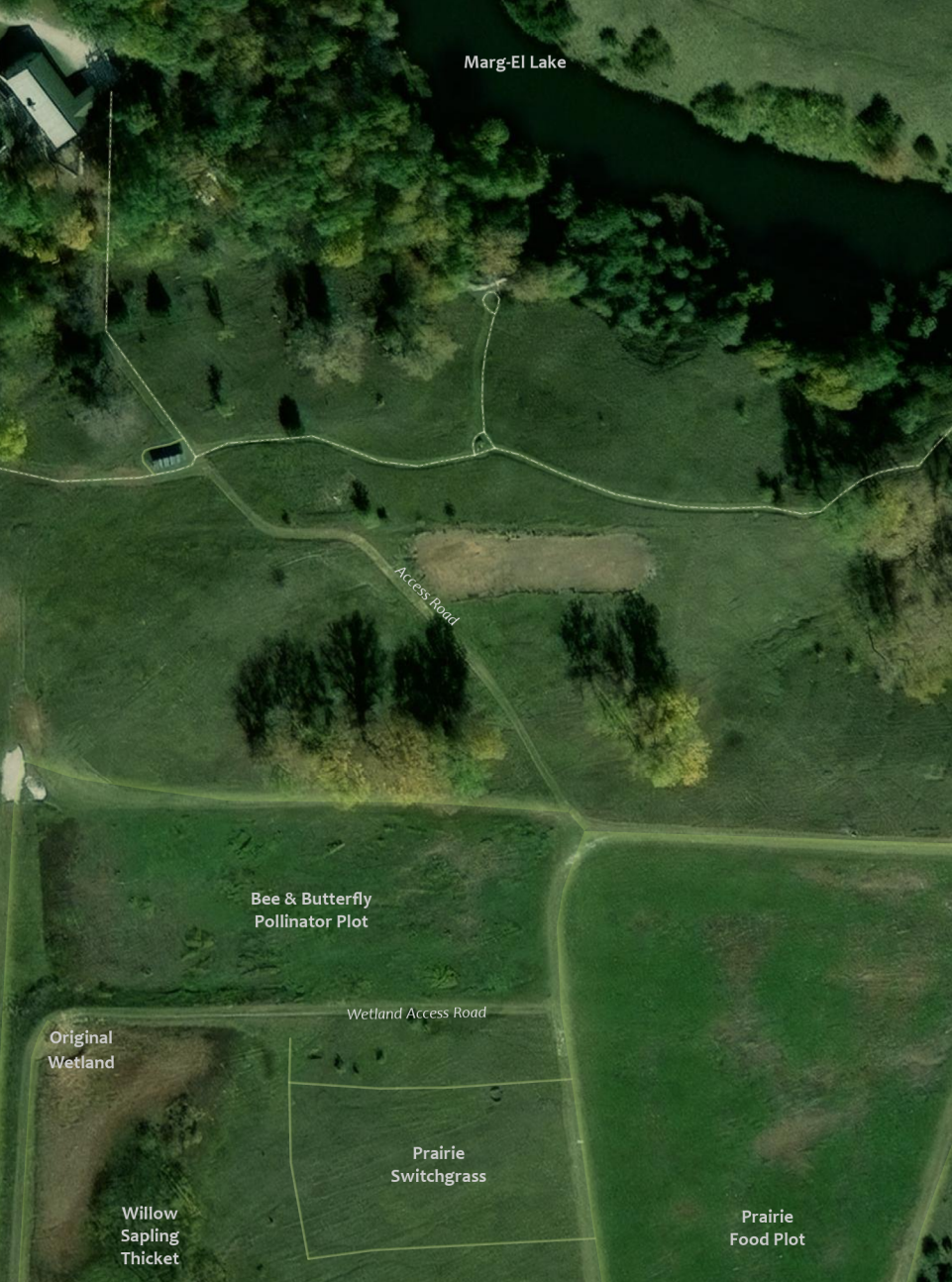
Using drone imagery, we captured high-resolution aerial views of the camp, allowing us to digitize important features with precision. This data forms the foundation of our maps, ensuring accuracy and detail.
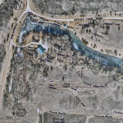
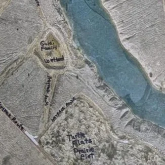
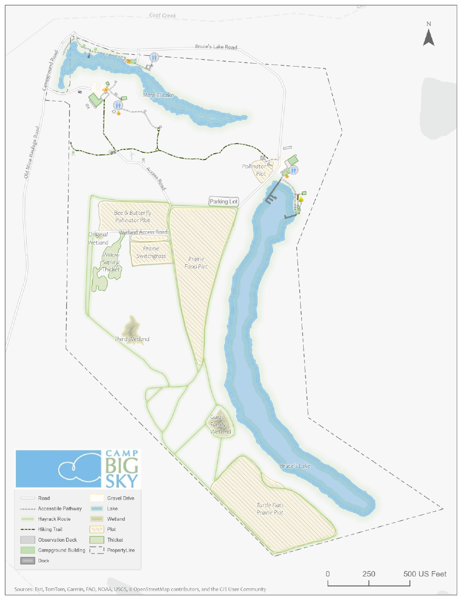
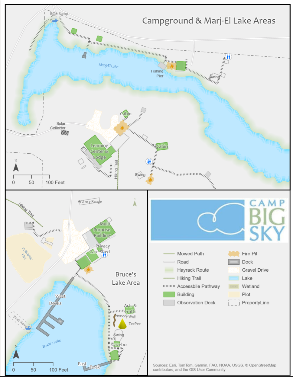
We provided the founder of Camp Big Sky, Brad Guidi, with a poster-sized printout of the aerial imagery. He identified the names of the features that had been digitized so that we could develop a GIS database that includes:
Natural features like lakes, trails, and tree cover.
Infrastructure elements such as buildings, parking areas, and accessibility features.
Points of interest that allow visitors and staff to both enjoy and navigate the camp more easily.
Mapping paper products like a wall map with great imagery or a 8.5 X 11 photocopy to hand out to visitors.
The Impact
These maps will help visitors, volunteers, and staff make the most of Camp Big Sky’s outdoor experiences. The GIS solution will also enable the organization to manage their property more efficiently and plan for future improvements. We have their GIS saved securely for continued updates or applications they may need.
By expanding beyond the original request for “a map,” we’re providing Camp Big Sky with tools that will help them enhance visitor experiences and support future growth and funding opportunities.
This project showcases how GIS technology can support nonprofits in meaningful ways, and we’re proud to contribute to Camp Big Sky’s mission.
To learn more about Camp Big Sky, visit their website at: https://campbigsky.org
If you have more question about how we can help you or your Organization with GIS, Contact us!

3275 Pixels is Plenty!
A recent project provided an unexpected yet valuable lesson in troubleshooting and understanding the limits of modern web mapping applications. In this post, we walk through our journey from a successful ArcGIS Enterprise 11.3 installation to unearthing a surprising resolution related to the Experience Builder’s map element size.
We recently completed a major installation of ArcGIS Enterprise 11.3 for a client, which included a complete data migration into their new system. Utilizing ArcGIS Pro, we published layers from their database directly to their new portal. Everything was set up for a seamless experience—until an unexpected issue emerged.
The Alignment Issue
After deploying the webmap in an Experience Builder application, our team noticed that the map layers were not aligning correctly with the basemap. Here’s what we observed:
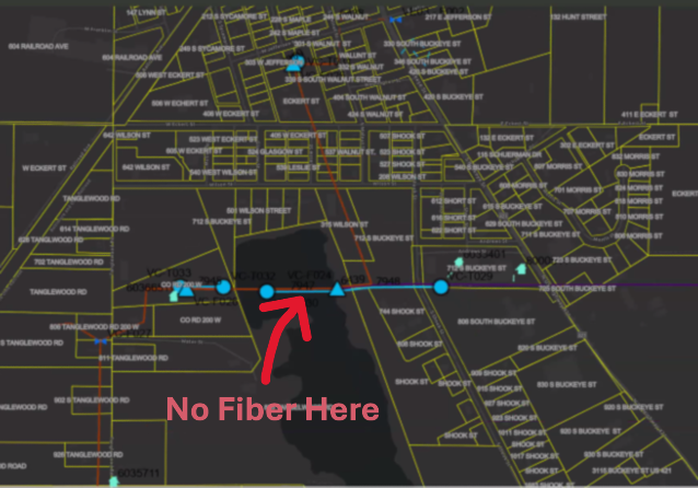
The image above is intentionally fuzzy.
Consistently Inconsistent: Despite verifying projections and coordinate systems, every republish of the map layers resulted in misalignment in the ArcGIS Portal webmap. The fiber network feature seemed to ‘hop’ around the map space.
Conflicting Results Across Devices:
The client’s computer exhibited persistent alignment issues.
Interestingly, when we accessed the portal on our systems, as well as on an iPad or another user’s computer, the map data aligned perfectly.
This inconsistency was perplexing and demanded deeper investigation.
The Debugging Journey
We began by rechecking every variable that could influence map rendering:
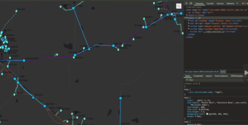
The image above is intentionally fuzzy.
Revalidating Projections and Coordinate Systems:
We double-checked all spatial references, confirming that there were no discrepancies that could cause the misalignment.Republishing Multiple Times:
Despite several attempts and republishing sessions, the misalignment persisted on the client’s main system.Browser and Cache Considerations:
We had the client try different browsers and even cleared browser caches—none of which resolved the issue.A Surprising Discovery with Developer Tools:
The breakthrough came when we noticed that opening Chrome Developer Tools seemed to “correct” the alignment. This was a critical hint that the issue might be related to the browser’s rendering dimensions.
The Root Cause: Screen Resolution and Size Limits
Digging deeper, we discovered that the primary client’s workstation featured a 49" wide screen with a resolution of 4216 x 976 pixels. When the browser window was resized (as it often is when opening Developer Tools), the map data would align properly.
After thorough testing, we pinpointed the issue to a specific limitation: the Experience Builder application’s map element appears to have a maximum width limit for properly displaying a mapping service. Our tests revealed that:
A Webmap element set to 3280 pixels would not align correctly.
Once we reduced the width to 3275 pixels, the map aligned perfectly.
This finding confirmed that the Experience Builder webmap element has a hard limit of 3275 pixels. Exceeding this limit can lead to unexpected rendering issues like the one we experienced. This is our experience, your results may vary.
Lessons

Screen Resolution Matters:
Large monitors and high-resolution screens can expose limitations in web application design that might not be apparent on standard displays.
Dynamic Testing Can Reveal Hidden Issues:
Simple actions like opening Developer Tools, which resize the browser window, can provide clues about underlying layout constraints.Set Explicit Limits:
When designing applications in Experience Builder, consider setting maximum element widths to prevent layout issues across different devices and screen sizes.Document Your Findings:
Sharing insights like these can help other developers avoid similar pitfalls and contribute to a more robust design for web mapping applications. We’re all swimming the dark, your discovery may open the door for someone else.
While our initial installation and data migration were successful, the misalignment issue provided an opportunity to dive deep into the nuances of Experience Builder’s rendering behavior. Understanding that a pixel limit of 3275 exists for the webmap element not only helped resolve our client’s issue but also highlighted the importance of considering display dimensions during application design.